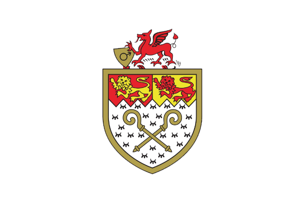
Consider this is an exercise to curb personal curiosity. Nothing to see here. The site is not associated with Wrexham AFC or any of its affiliates. I'm a Wrexham fan and dabbler in football crest design. This is purely an experiment inspired by the club and its history, not indicative of any plans to update the club crest or branding, now or in the future.
Thanks for taking a look.
For the initial release of this site, I once again reached out to the Wrexham online community for feedback. This time, the response was much more constructive compared to the rough draft I had shared earlier. The completed concept, along with a step-by-step explanation, made it easier for people to provide targeted feedback on the initial decisions.
While the overall consensus remained a “hard pass,” I gathered valuable insights that sparked new ideas for a better approach. This next version directly addresses some of that feedback and, hopefully, aligns more closely with what fans might expect.
Selected and Categorized
Yeah, I think the dragons look like a video game from the 80s.u/BillZZ7777
You've got a lot of line weights and styles. Some have a mitred end cap, some you allow to come to a point.u/Sad-Pain4814
If you were to approach a redesign, I would see about getting rid of the Monarchist swan feathers and replace them with a Wilkinson Sword arrangement of Daffodils and leeks, and replacing 'Ich Dien' with some Welsh saying like Yma o Hyd or Cofio Gresford.u/swirlyglasses1
I agree with a couple others about the dragons, they just do not look that great in the ridged pixelated form you have them in.u/LethalVegetable
Wrexham AFC have been around long before Rob & Ryan, and will continue to be around long after. It might not be in the design's best interest to incorporate subtle nods to them in the first place that (hopefully never!!) if it ever goes south they'd have to break up with the crest as well hahah.u/xxiturnips
Bit to megadrivey for me tho.u/Deep-Abbreviations-5
nods to owners who, whilst appreciated hugely by the club now, are not so central to the club and its history (nor its long future) that so much of a redesigned crest should be dedicated or inspired to them specifically.u/jambobar
I love everything but the dragons design, and the three whatever they are called coming out of the ball.u/Dwesnyc
It's fairly busy using the Turf lines.u/soundwithdesign
This makes it look a bit messy - is it pixel art? The text as well is sliding into the world of pixel art for me.u/Sad-Pain4814
The pixel art/arcade game aesthetic cheapens it, leaving it feeling like something from a Flash game on the web.u/jambobar
As a proud Welshman anything that removes the English feathers and German text is an improvement. 👍🏻u/wrecksem_usa
Nope, still looks like it was made on a Commodore 64.u/AustralisBorealis64
Don't think the logo should be incorporating favorite other teams of the owners or their movie projects. I get the desire to, but that seems too temporary and fickle in a logo that represents such a storied club.u/theyterkourjobs
I don't like the logo as it feels too video gamey and I personally LOVE the medieval feel of almost all the English clubs logos.u/spade030
I like a lot of the reasoning and elements, but it's significantly overly detailed and comprehensive.u/greenandplenty
tbh I don't mind your badge, if the dragons were less boxy I think it would work as a real club badge.u/laughingthalia
Some of the feedback took me by surprise, particularly the repeated references to “pixel art.” I can understand where that impression might come from, but it wasn't my intention at all. I've always gravitated towards thick lines, geometric shapes, and vector art. While this was the most common feedback, I did notice a few other recurring themes worth mentioning:
Mentions of ownership were seen as inappropriate and unwelcome.
Feedback highlighted issues with line weights, detailing, and overall complexity.
The style was often described as resembling video games, with an 8-bit or pixel art feel.
The meaning behind certain elements within the crest was unclear or not well-received.
This feedback makes complete sense. The addition was a playful concept, but it's clear that most fans wouldn't appreciate it. We'll remove the subtle Deadpool reference. The dragon wings have also been adjusted to tone down the silhouette, which was a bit of a reach to begin with.
In this next iteration, the line weights have been standardized to two variations, and many of the unnecessary details from the initial version have been removed.
This is a fair point. As mentioned earlier, the design is vector-based, which allows for infinite scaling. However, it was intentionally crafted to work best at smaller sizes, like on a cap or the upper left chest of a shirt. Displaying it at a larger size may have contributed to the blocky feel. Additionally, the scale of the dragons, in particular, emphasizes their rigid shapes.
To address this, we're reducing the size of the dragons by half so that they fit better within the badge shape, similar to the current crest. This, combined with the updated line weights, should make them appear less pixelated. We're also updating the font used in the banner, shifting from a custom line-based typeface to a more traditional Gothic style.
In this version, we've taken the simplification a step further by completely removing the feathers. In their place, we've added a bunch of leeks beneath the daffodils held by the dragons.
I hope this updated version is a bit closer to something the fans might appreciate. The feedback I received was invaluable in helping me understand more about the club and the community that holds it dear.
Thank you again for engaging with this process. Below is the original version of the site:
First of all, I don't dislike the current situation. The shield shape is nice enough, and I appreciate how the banner interacts with it. My main issue is the lack of symmetry— the crown, the football, and the feathers all feel wonky.
The feathers look kind of like wangs. The hierarchy feels off. There's this huge section dedicated to honoring the heraldry of the Prince of Wales. The club's name then feels squeezed in at the end. Having the foundation year listed twice seems like an afterthought.
Overall, it's a bit sloppy— and still pleasing in that way, but on the border of being amateur.
Respectfully, a new crest doesn't destroy the old. Each new iteration marks a different era, celebrating change and achievement. It shouldn't be considered sacrilege to entertain the idea of change.
Here's an idea ↓
"The shield shape is nice enough."
We will retain the general gist of the form. This design will continually pay tribute to the existing badge. You'll notice that the overall silhouette will eventually change, but this familiar foundation stays intact.
To bring more fitting symbolism to the top of the crest, we're incorporating details from an institution central to the club's formation.
The Turf Hotel has been the go-to spot for Wrexham's fans on match days and proudly holds the title of being the only pub in the entire United Kingdom built inside a football club's grounds. It is the oldest public house at any sports stadium worldwide. Here, on October 4, 1864, the Denbighshire County Cricket Club convened to form what would become the Wrexham Football Club.
The section above the front door is meant to resemble the Tudor Revival style architecture seen in buildings like The Talbot, located in Wrexham city centre between Hope Street and Queen Street.
Sticking with the conventions of the current crest, the shield color blocking is an inverse of the Welsh flag— Green and White with a red stripe separating the two.
A constant in the badge since it was a version of the Wrexham borough coat of arms, a red dragon is necessary. This iteration is a cross between the very original crest, which used a dragon closer to the Welsh flag, and the newer orientation of double dragons. Theses dragons stand with one foot on the ball, their overlapping claws forming a crown shape that echoes the imagery of the previous crest.
The wings are meant to be arranged in a way that might remind the viewer of the Philadelphia Eagles, a team close to the heart of one of the new owners of the club.
You'll also notice a ruby between the beasts— which, when combined with the claws of the dragons, creates a symbol with a likeness to the disembodied head of Deadpool. A character from the Marvel Cinematic Universe played by another of the club's new owners.
In another ode to the badges which came before, the year of formation is prominently featured. This time, it's only once, among ermine spots and between the red dragons.
The club name remains on the gold banner, now more prominent within the shield and more legible from a distance.
See— no harm done.
The aim was to create something that strikes a balance— not overly simplified, "modern," or minimal, but also not unnecessarily complicated. Something decorative, but not cosplaying as vintage. I'm not sure if that's what happened, but either way, researching this project was a fun way to learn more about the club and its history.
I understand that redesigning something so beloved can sometimes be controversial. I don't mean any disrespect. This sort of thing is what I do for fun, and I appreciate you humoring me with your attention.
I'd love to hear your thoughts.
For this project, I dug all over the internet to find information on the history, previous crests, and other concept exercises.
Many thanks to these communities and individuals for providing such a bag of knowledge. I'm inspired by your love for this club and town.